
Our recent post “In Praise Of Style And Grace” brought about some brisk discussion on Facebook, mostly on matters of proportion when it came to lapel and tie widths back in the day. For the first half of the ’50s they were fairly neutral, and by the late ’60s they had already swept back to neutral and inching towards wide.
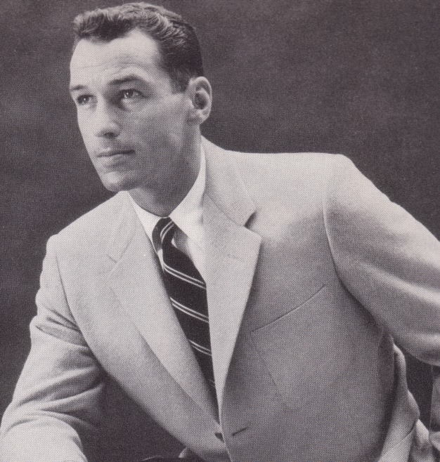
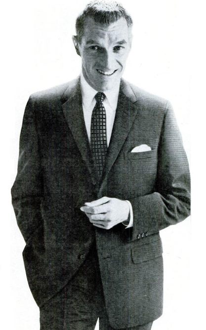
Facebook member and frequent commenter Carmelo stepped in with samples from his extensive image collection, showing the arc of proportions across the decade of the 1950s. Around 1957, he feels, is when things started to get skinny.
The final image says it all: “Only seven years but worlds apart.” That’s fashion. — CC


Does anyone know the context of the top image (the one on the article’s “cover”)? Upon closer inspection, I noticed that the paper the man is holding says “Scarsdale” (which is a town closer to where I live) and I know that there is a Brooks store that has been there for a long time. However, I do not recognize the sun-like symbol in the picture.
Nah, give me the ‘Milano’ cut. Ha ha.
@GS, there’s no denying the heat properties belonging to the colors orange and yellow, so that taken together with the sun symbol may be code for The Tropics, and the suit itself may be fabricated in the [new?] tropic weight wool. Just a guess.
@GS The man in the top picture is holding a New York Central Railroad Harlem Line timetable showing the trains between Scarsdale and Grand Central Terminal.
@GS, as Roycru points out, that’s a train schedule. Metro North still prints single-station schedules in pretty much that same format.
Lapels and ties…about the only things marketers can play with to ever-churn the eager and gullible into spending. Middle of the road always seems to survive, though…never winning, never placing, but always showing, and that’s plenty good enough for me. As for skinny lapels, every time I have that thought the image of Sean Connery in Goldfinger comes to mind. Can’t shake it.
@Roycru @cameron that makes perfect sense, thank you! @Flo I see thank you, it does seem to be an advertisement for a light weight, summer suit.