My latest piece for Ralph Lauren Magazine allowed me to learn about how the US prepares for the Olympics, as well as bringing the opportunity to interview gold medal wrestler Jordan Burroughs. RL has a close relationship with the Olympics, having provided the uniforms for a number of years.
But the games in Rio are occuring at a particularly polarized point in American history, characterized by high-pitched digital outrage over everything that can be seen as traditional and classist. When the new uniforms were unveiled last month, sites such as Mic, Slate, and The Huffington Post threw every preppy slander they could come up with. Jezebel probably sums up the sentiment best with its headline “WASPy bullsh*t.“
Actually, we’ve been down this road before.
If we here in Tradsville were going to offer any critiques, it would probably be that the 2016 uniforms are quite on the casual side. Then again, Brazil in the summer is probably pretty muggy.
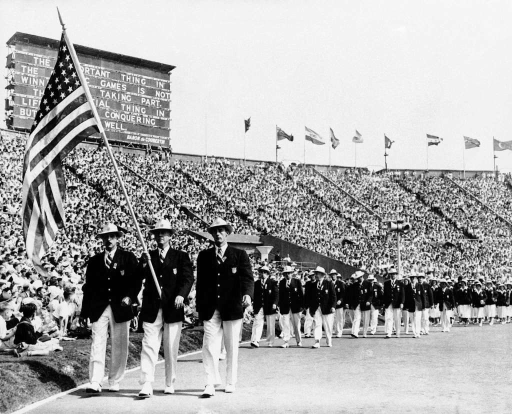
Here are some of the better (that is, non-cowboy) uniforms over the years. — CC
Top image, 1960. Below, 1952:
The toggle coats of 1956:
1964:
Post Ivy heyday 1968:
Yuppie ’80s in 1988:
Back in 1932, it was cricket/tennis sweaters and berets:
Berets and double-breasteds for 1936:
Short jackets for 2012:
And finally, 2016:


1968 are absolutlely Ivy: is the double breasted undarted blazer, popular at J Press in 60s.
In 2012 the uniforms were made in China and the berets were made in Canada. Any idea where they were made this time?
My vote is for this one (at left), from 1932:
https://s-media-cache-ak0.pinimg.com/736x/5b/66/b1/5b66b1f29ec44fe8736d09f624cf02ff.jpg
@Carmelo
But with the turtleneck and light pants with dark shoes? The whole outfit seems more characteristic of general fashion of the time.
Mr. Lauren, why the large logo? Your reputation for quality traditional clothes is well established. No need to tell everybody who you are anymore.
Will
Christian: Rio in summer is unbearable. I have been there. Fortunately, these “summer” games are being held in Rio’s winter, if you can call it that. It actually should be pretty pleasant.
I love those hats from 1960. Anyone know of a hatter that makes something like it?
There should be limits on the size of the logo, if any.
@Christian,
This is a Brooks brothers window shop of 1969:
http://s33.postimg.org/mwgf29zjz/doubleivy10.jpg
Of course is not the 1955 Ivy,but the undarted four buttons DB is absolutly “kosher” for Ivy.
Light trousers with dark Weejuns are a “faux pas” for a Ivyst?
I don’t think.
Turtleneck maybe are not “kosher”,but are in use from 30s at least.
By all means let’s outfit the Olympic team in some trendy “streetwear” or hipster douche clothes; a few years from now they’ll probably need a laugh
Although I usually enjoy reading it, WASPy Bullshit is a great title for the comments section on this site!
The large logo on this year’s uniform is ironic in that polo has not been an Olympic sport since 1936.
I am not in love with the 2016 choice for our Olympic team representation. However, it could be worse. I realize allowance for climate is practical I just wish it was a more formal presentation, and no logo at all. Everybody knows Ralph is a big deal. It should come off more as an honor for Ralp Lauren to be chosen than as an opportunity for him to advertise. The Ivy League/Preppy look is quintessential American nobody should have a negative issue with that. I wish that you had not used “cowboy” as a negative. Pick on Hippies or some other group. I have closet cowboy tendencies.
Since 2012, Olympic uniforms by RL have been made in USA, but the 2012 uniforms were the best looking, with a sweater vest very similar in appearance to the 1932 vest. RL volunteered to do the uniform after dissatisfaction with Roots, the previous supplier.
When I lived in the Midwest, years back, the standard garb was a blue OCBD, chinos, and penny loafers from Lands End and nobody thought they were imitating WASPS, preppies, whatever.
Now, if I understand correctly, one can be accused of being classist, reactionary, etc., for wearing the same clothes.
To make the media happy, may I suggest hoodies with thongs? They seem to like it when The Kardashian’s ware it!
Sent from my iPad
If those logos are not for demonstration purposes only during introduction then we can be certain that the U.S. will have the tackiest uniforms in Rio.
The Olympic seal or logo seems rather insignificant opposite the exceedingly large embroidered horse. Post Olympics, if no one washes their shirt first, a seam ripper should remove all vestiges of the Olympic patch and what the clothes were suppose to represent.
Madras is wonderful in muggy Louisiana this time of year and I bet it’d be just as pleasant in muggy Brazil.
@Ol Nippy
A better description of Muffy’s defunct comments section, but a fine wisecrack nonetheless!
^ Lol, that is a great WASPy response to that comment.
C. Ray,
Stetson makes a porkpie straw hat called the Madrigal that is similar to the 1960 hats.
RE: Hat 1960 for C. Ray
I love hats and your interest in the hat prompted me to look around a little. The hat appears to be a Boater also called a Skimmer. Most of the time a Boater has a lower crown and wider brim than shown here. However, I have found some versions in line with the dimensions of the hats you see in this photograph. Also, at one time it was not uncommon for the Boater to be used as part of an athletic persons outfit off the field. Some of the guys in this photograph have the back of their hats worn up. I think this is just a sign of their era. Some of them are wearing a modified Boater like a person of that time would wear a Trilby(short brimmed fedora). My sons and I jokingly refer to a Trilby as a “who shot J.F.K. hat”. Also, the unbashed crown and wide ribbon is another reason I say the hat is a Boater.
You can still find a (tall Boater with a narrow brim )if you google that very description. Hatters such as Stetson and Bailey will likely be the maker. Or make your life easier and follow Mr. Henry Contestwinners advice and go for the pork pie.
The naive idealism of the good Count de Coubertin on the sign from second image (1952): “The most important thing in the Olympic Games is not winning but taking part; the essential thing in life is not conquering but fighting well.” Really? How many of the athletes pictured would say, if interviewed, that they’re just there to participate and do their best? What a crock. Having lived in Colorado Springs for many years, I can assure you that a good many athletes aim to parlay Olympic victory into fame and fortune…and more fortune. They’re in it to win it, and that’s just fine with me. They should be, IMO. That notwithstanding, I still love the games, all of them.
WASPy Bullshit? For a class that is on its last dying breath the media certainly does what it can to resucitate us if only by stomping on our chest to keep the heart beating. Considering Ralph as true Wasp garb is a calumny to the acronym. It’s an aspirational brand through and through particularly since the advent of the “Factory Store.” The advent of these ridiculously proportioned logos only reaffirms this. I give Mr. Lauren the benefit of the doubt that he had nothing to do with that decision.
Am I the only one who is disturbed by the unshaven face of the fellow on the right in the 2016 photo?
That’s Jordan Burroughs, the gold medal wrestler I interviewed.
I think you should tell him to his unshaven face.
1964 hats a nod to LBJ and Texas.
I hear that the next Olympic Games will have a very, very different logo. And, it’ll be amazing. The background has the image of a large office building and the foreground a bold, gold ‘T’. And, it will be larger than the RL pony. Nice work, you silly republicans. You are making America great again!
The 2016 uniform is a bit too precious, with the undershirt and rolled sleeves.
I prefer the Australian uniforms, who seem to have taken a page from the traditional Bermudian uniform. They are even sporting white bucks.
http://www.theaustralian.com.au/sport/rio-olympics/australias-olympic-team-uniforms–for-rio-2016-our-fashion-editors-verdict/news-story/746d105205ab7421e71e402dbcb701c7
Christian, it’s not all too surprising such sites reacted that way (you may know why). If anything, it’s an overreaction. They give away their cards when they choose such a tone and words.Mic’s eagered “We NEED to talk about . . . ” Gotta love the open-dialogue card, as if talking about prep clothing will heal the hurt souls.
@Left-handed Pants: Put down the scotch. Didn’t your doctor say only one glass a week, no earlier than noon? Sheesh.
interesting to see how many other countries other than the US forced their athletes to wear blazers and other such Waspy bullshit tonight.
The hats in the 1960 image by themselves are fine, it’s the broad hatband that triggers my gasp. Vertical alternating stripes? Does anyone know what the colors were? They look like a delegation at a political convention.